
Compare Pale Clothing Shades Without Demanding an Exact Match
Compare pale clothing shades through the actual pieces and ordinary light, keeping a visual preference separate from assumptions based on similar colour names.
Shopping disclosure: links within this story are ordinary retailer links. Separately identified advertisements elsewhere on the page may contain affiliate links. Our full disclosure.
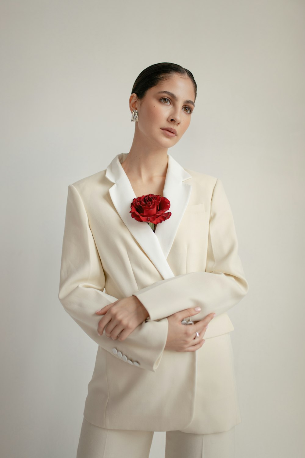
Pale clothing shades can sit together without being exact matches. Compare the actual pieces in the ordinary light where you will use them and notice the relationship you enjoy. Similar colour names on labels do not establish identical appearance, and a screen image is not a precise reference. A useful comparison can leave the group deliberately varied rather than turn every small difference into another shopping problem.
Identify the pieces that will be seen together
Choose the top, layer and lower half you actually intend to wear. A close colour relationship matters differently when one piece is mostly hidden than when two broad areas sit beside each other. Look at the real amount of each shade before judging a small fabric detail in isolation.
Keep the outfit's role clear. A weekday combination, a dinner group and a travel layer may have different practical requirements even when the colours are similar. The pale palette does not need to become a reason to ignore the activities the clothes must serve.
Compare in the room's ordinary conditions
Look at the pieces together rather than remembering one while holding another. Notice whether the difference is pleasing, distracting or barely relevant to you. A warmer-looking area beside a cooler-looking one can be described as an observation without assigning it a universal styling value.
Do not infer exact colour through a product name or a photograph made under different conditions. If a specific match matters to a purchase, use appropriate actual product information or a suitable sample and leave an unresolved question open.
Include texture without confusing it with composition
A visible knit, smooth surface or layered edge can make similar shades feel distinct. You may enjoy that difference more than an exact colour repetition. Keep factual material and care questions on their own reliable basis rather than identifying fibres through appearance.
The clothing composition reference guide helps preserve the actual information behind the garment. A visual palette can be considered separately from whether the pieces share a suitable care routine.
Try the full group before adding an accent
Use the intended shoes and bag and look at the outfit from an ordinary distance. A small contrasting detail may already provide enough connection, or you may prefer the quieter pale group on its own. There is no requirement to add a strong colour merely because the shades differ.
The relaxed dinner outfit guide offers a way to build through existing clothes. A pale combination can have one clear role without requiring every accessory or future purchase to match it.
If you dislike the relationship, choose another existing pair of pieces or leave the proposed purchase open. You do not need to replace the whole group to solve a small visual preference. Keep a short private reference to the actual combination if useful. The decision is complete when you understand why the shades work for you, not when a label or photograph declares them identical.
A little more to adore
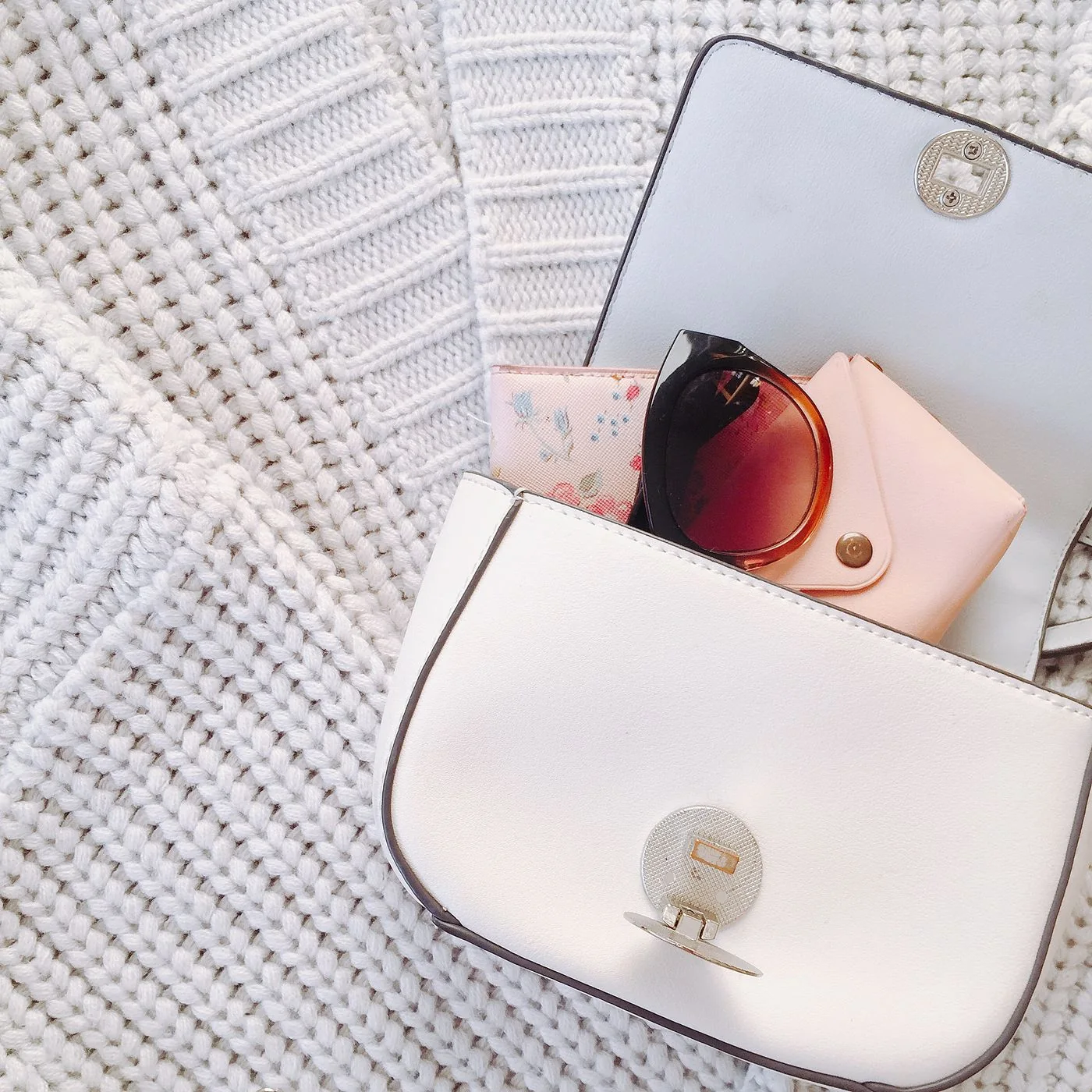
Compare Bag Hardware Colour with Existing Outfit Details
Compare the visible colour of bag hardware with existing outfit details, choosing a relationship you enjoy without treating a photograph as proof of material composition.
Read the story →
Give a Blazer Lapel and Shirt Collar Comfortable Space
Give a blazer lapel and shirt collar comfortable space through actual layers, front and back fit, normal movement, intended fastenings, and complete outfit use.
Read the story →